
Why the $50K Website Didn’t Work
A CEO once told me, with the kind of exhaustion that usually follows an expensive lesson, “We just spent $50,000 on a new website. It’s beautiful. But we’re not getting leads.”
I believed both parts immediately. I believed the website was beautiful — I’ve seen plenty of beautiful websites that do almost nothing for the business. And I believed it wasn’t generating leads, because design can only carry so much weight. A great website can make a clear story more compelling and easier to navigate. It can build credibility and help a buyer understand the company faster. But a website can’t solve a clarity problem by itself.
If the positioning is unclear, the messaging is vague, the audience is too broad, or the company can’t explain why it matters in a way that lands quickly, a new website just gives the confusion a more polished container. That’s an expensive way to stay stuck.
Why a website redesign is usually the wrong starting point
When a company says “we need a new website,” I want to know what problem they’re really trying to solve. Sometimes they genuinely do need one. The current site may be outdated, hard to navigate, or disconnected from where the business has gone. But often, “we need a new website” is shorthand for something deeper.
We can’t explain what we do clearly. Our story has changed but our messaging hasn’t caught up. We serve a more specific audience now, but the site still speaks to everyone. Our sales conversations are stronger than our public language. Our best thinking lives in the founder’s head, not in the brand. Those aren’t website problems. They’re positioning and messaging problems that happen to be visible on the website. And if you misdiagnose the problem, you can spend a lot of money solving the wrong thing.
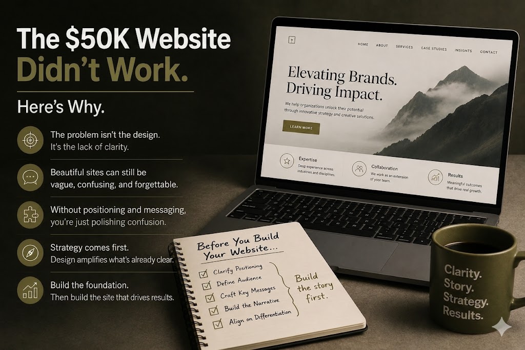
The trap of a beautiful but strategically empty website
This is one of the traps of modern marketing. A website can look extremely credible while saying very little. The design can be sophisticated. The photography can be tasteful. The animations can be smooth, the typography excellent. And the visitor can still leave thinking, “I’m not sure what they do.” Or worse: “I think I know what they do, but I don’t know why I should care.”
A visually strong website also creates the feeling of progress inside the company. Everyone sees the new homepage and feels the brand has leveled up. The team is excited. The board is pleased. But the market isn’t grading the site on how much effort went into it. The market is asking simpler questions. What is this? Is it for me? What problem does it solve? Why does that problem matter? Why should I believe this company can help? What should I do next? If the site can’t answer those quickly, design won’t rescue it.
B2B homepage strategy: Clarity is what design multiplies
Good design isn’t the enemy here. Design is essential. But design is a multiplier, and a multiplier needs something to multiply. When the underlying message is clear, design makes it sharper, faster, and more persuasive. When the message is unclear, design makes the confusion look more confident. The same investment produces a very different result depending on what sits beneath it.
This is why I rarely recommend starting a website project with the website. I recommend starting with the questions the website is supposed to answer. Who is this really for? What do we want them to understand in the first ten seconds? What’s the one problem we want to own? What do we want them to remember after they leave? When those answers are clear, the website project gets faster and the arguments get smaller, because the team is no longer using the homepage to resolve a strategy debate.
The website redesign process order that actually works
The companies that get real value from a website tend to build in a particular order. They clarify positioning first — where they sit and why they matter. They translate that into messaging the whole company can use. They shape a narrative that gives the story movement. Only then do they design the site to express all of it.
That order feels slower. It’s actually faster, because each decision downstream has something solid to stand on. The homepage hierarchy becomes obvious. The page structure follows the story. The copy stops trying to do the strategy’s job. Reverse the order — design first, meaning later — and you get the $50,000 website. Polished, professional, and quietly unable to explain the company. The design team did their job. They just did it on top of a foundation that wasn’t ready.
What I told the CEO
I didn’t tell that CEO to rebuild the website. The website wasn’t the problem. I asked him to tell me, in one sentence, who the company was for and what made it different. He gave me four answers, and they didn’t agree with each other.
That was the real finding. The website wasn’t failing to generate leads because it was badly built. It was failing because the company hadn’t yet decided what it wanted the market to understand. The site faithfully reflected that indecision in a very expensive font. The fix wasn’t more design. It was clarity — the positioning and messaging work that should have come first. Once that was settled, the existing website got dramatically more effective with relatively small changes, because it finally had something clear to say.
A beautiful website is a wonderful thing to own. But it’s the last mile of a longer road, not a shortcut around it. Before you invest in how the company looks, invest in whether the company is understood. Get that right, and the website becomes what it was always meant to be — not the thing that creates clarity, but the thing that broadcasts it.
--
About Stone Soup Strategy: Stone Soup Strategy helps companies clarify their story, sharpen their message, and build marketing systems that support intentional growth. We partner with growth-minded organizations through focusedProductized Messaging Sprints, ongoingFractional Marketing Leadership, and flexible custom consulting. Find your brand's starting point at www.stonesoupstrategy.marketing.
